Social Scheduling.
2023-2024 • SaaS • B2B Enterprise • Product Design • Product Strategy • Research

Social Scheduling.
Social Scheduling.
2023-2024 • SaaS • B2B Enterprise • Product Design • Product Strategy • Research
Team
Team
Myself, 2 Product Managers, 1 Product Director, 1 Design Manager, 10+ Engineers
Myself, 2 Product Managers, 1 Product Director, 1 Design Manager, 10+ Engineers
Approach
Approach
Design systems, Stakeholders interviews, desk research.
Design systems, Stakeholders interviews, desk research.
Tools
Tools
Figma, FigJam, Google Docs, Slack, Zoom and Human intelligence
Figma, FigJam, Google Docs, Slack, Zoom and Human intelligence

This wasn’t just another feature — it was the surface. The place where real work happened. We removed anything that got in the way, optimized for speed, and made editing feel natural. It didn’t scream for attention but provided necessary insights for team manager to plan.
It just worked — and that’s exactly what our users needed.
Some Science behind Schedule view
Some Science behind Schedule view
Schedule view was the heartbeat of campaign planning in Khoros. It’s where marketers spent most of their time — milestone planning, editing, checking, and adjusting posts, adding media to posts across different channels. Everything we designed here had to be quick, reliable, and invisible in the best way. Khoros Scheduling views have a MAU of 10,000 marketers (intentionally vagued number), the traffic may be vary according to customers internal planning timeline.
In Business words, this is one of our customer retention piece. What follows is a breakdown of what we did, why we did it, and how it landed — in my own words.
Problem
Problem
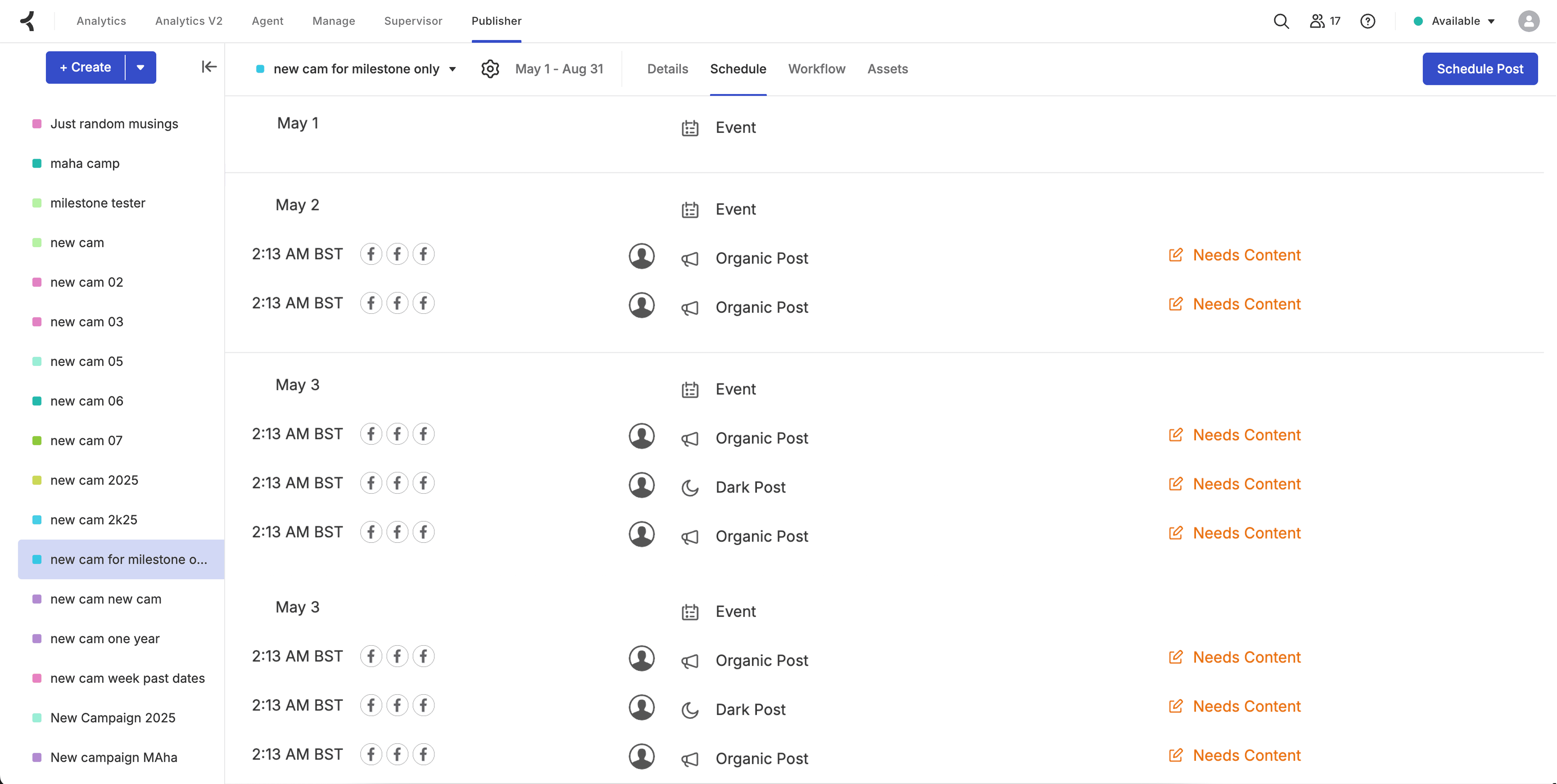
While diving into customer support tickets and listening in on calls, I noticed a few issues with the current setup. One big takeaway I got was that we lost some important deals because of the limitations in the Schedule UI. These insights below screamed some areas of improvement!
While diving into customer support tickets and listening in on calls, I noticed a few issues with the current setup. One big takeaway I got was that we lost some important deals because of the limitations in the Schedule UI. These insights below screamed some areas of improvement!

Snapshot
Users struggled to get a quick snapshot of content volume — there were no bar graphs, so spotting gaps or overloads meant scanning manually.
Post Discoverability
There was no intuitive structure for date-based grouping — everything lived in a flat list, with no weekly or milestone-level organization.
Contextual Post Creation
Post creation broke flow — opening a post launched a full-screen modal, forcing users to lose sight of the calendar and context.
Navigation
Navigation and findability were major pain points — scrolling was tedious, and users couldn’t easily jump to a specific day or post, let alone search for it.
Snapshot . Timeline view
Snapshot . Timeline view
We rebuilt the entire view around a timeline. Posts grouped by week or milestone. Familiar, like Google Calendar meets campaign tracker. Most social teams already think this way — in bursts and deadlines — so we weren’t trying to reinvent the wheel. Just give them a more elegant, structured version of how they already work. It instantly felt native.
We rebuilt the entire view around a timeline. Posts grouped by week or milestone. Familiar, like Google Calendar meets campaign tracker. Most social teams already think this way — in bursts and deadlines — so we weren’t trying to reinvent the wheel. Just give them a more elegant, structured version of how they already work. It instantly felt native.

Row bar states
Row bar states

Week block
Week block

Discoverability . Milestone vs Week View Switcher
Discoverability . Milestone vs Week View Switcher
Keeping Raising the Bar -> We added bar charts on top. Each bar shows how many posts go out on a given day. It’s there to help users catch overload or empty spots fast. Clicking a bar scrolls to that day’s posts below. Super quick way to jump around. Users loved how easy it was to spot gaps or busy days without hunting.
Keeping Raising the Bar -> We added bar charts on top. Each bar shows how many posts go out on a given day. It’s there to help users catch overload or empty spots fast. Clicking a bar scrolls to that day’s posts below. Super quick way to jump around. Users loved how easy it was to spot gaps or busy days without hunting.
Milestone headers weren’t just bar charts. They became anchors to the dates. Clicking one would instantly scroll the user to that campaign slice. This helped with long campaigns — no more hunting through walls of content. It sounds simple now, but during testing, this was one of the features that made folks say “ohhh this is nice.”
Milestone headers weren’t just bar charts. They became anchors to the dates. Clicking one would instantly scroll the user to that campaign slice. This helped with long campaigns — no more hunting through walls of content. It sounds simple now, but during testing, this was one of the features that made folks say “ohhh this is nice.”
Week Graph
Week Graph


Milestone Graph
Milestone Graph


Contextual Post Creation . Optimising for Speed
Contextual Post Creation . Optimising for Speed
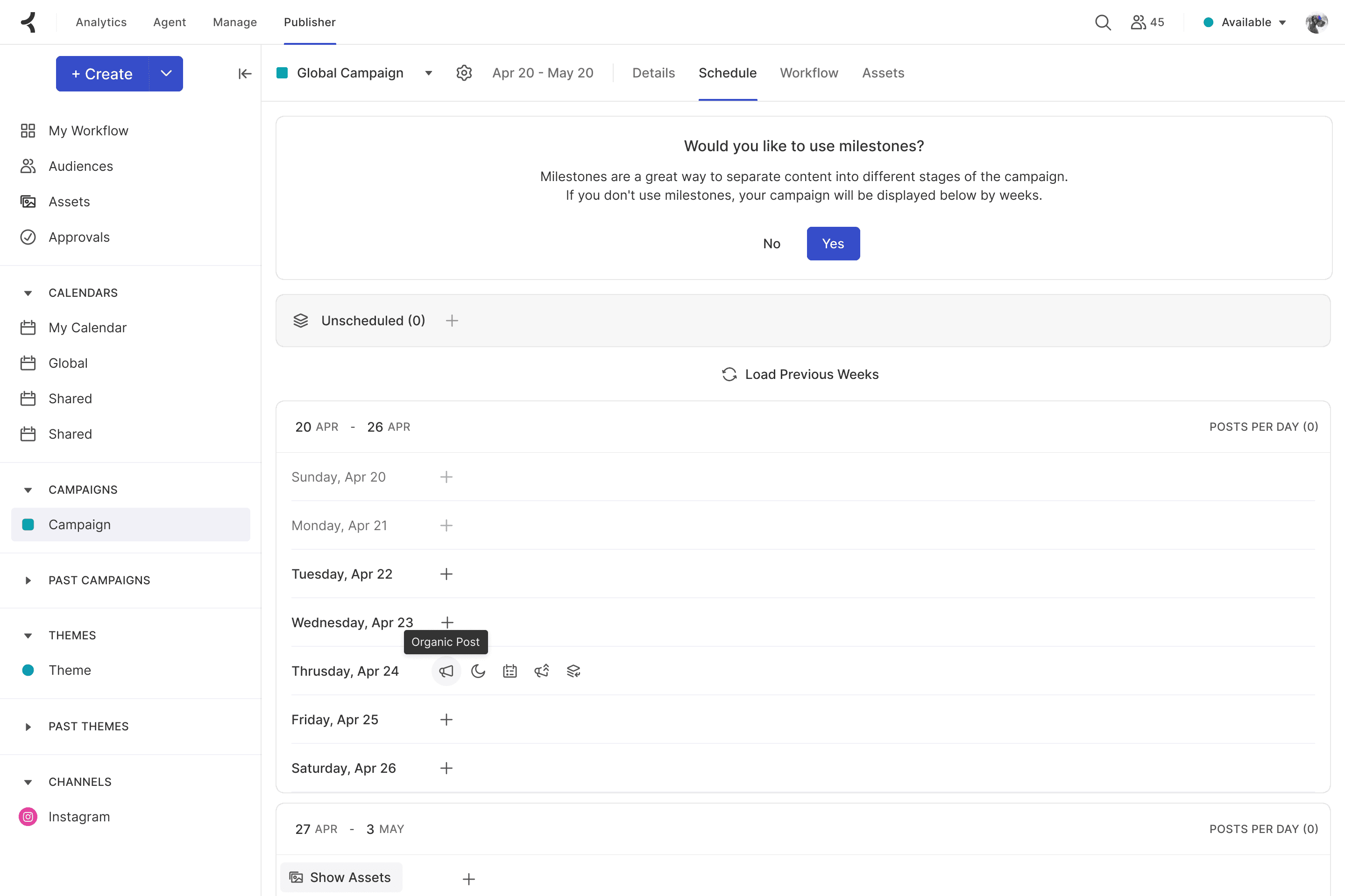
Creating posts needed to feel light. We ditched modals. Instead, users click inside any day group and boom — a new row appears, ready to fill. Keeping the action in context (instead of bouncing to another screen) was key. It turned scheduling from a task into a flow. Less “click click click,” more “yep, that’s done.'
Creating posts needed to feel light. We ditched modals. Instead, users click inside any day group and boom — a new row appears, ready to fill. Keeping the action in context (instead of bouncing to another screen) was key. It turned scheduling from a task into a flow. Less “click click click,” more “yep, that’s done.'
Create Action Explorations
Create Action Explorations


Since we didn't had a mobile use case, we surfaced hover based menu reveal as opposed to click based dropdown which created friction when user had back and froth between dates
Since we didn't had a mobile use case, we surfaced hover based menu reveal as opposed to click based dropdown which created friction when user had back and froth between dates
New Post Row
New Post Row

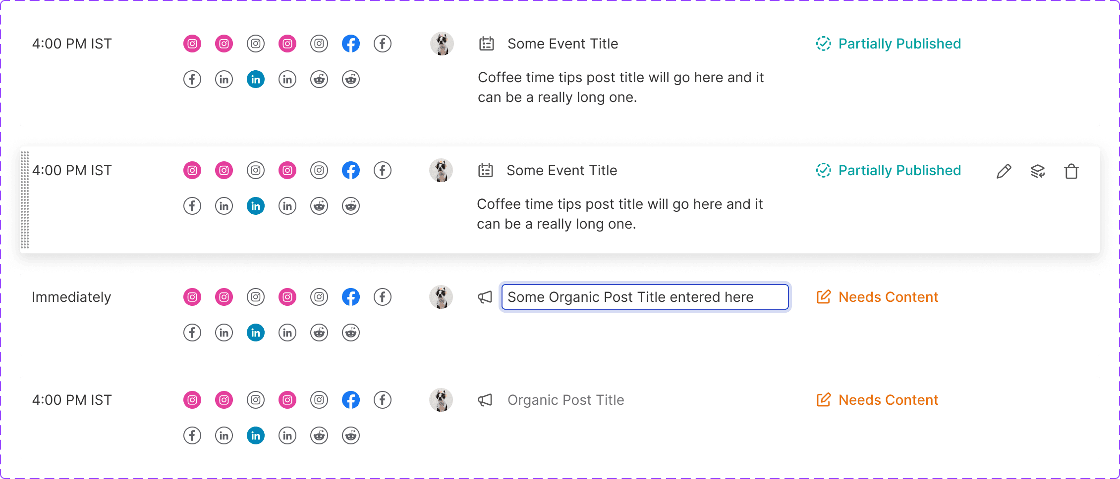
Each post row showed type, time, channel, and caption. Just enough to get what you need at a glance. Then, on hover, you get the rest. This was a classic case of progressive disclosure — keep the UI clean upfront, but still powerful under the hood. Power users loved it. New users didn’t feel overwhelmed. Win-win.
Each post row showed type, time, channel, and caption. Just enough to get what you need at a glance. Then, on hover, you get the rest. This was a classic case of progressive disclosure — keep the UI clean upfront, but still powerful under the hood. Power users loved it. New users didn’t feel overwhelmed. Win-win.
Post Card Anatomy
Post Card Anatomy

Post Card States
Post Card States

Navigation . Quick And Easy
Navigation . Quick And Easy
Each post row showed type, time, channel, and caption. Just enough to get what you need at a glance. Then, on hover, you get the rest. This was a classic case of progressive disclosure — keep the UI clean upfront, but still powerful under the hood. Power users loved it. New users didn’t feel overwhelmed. Win-win.
Each post row showed type, time, channel, and caption. Just enough to get what you need at a glance. Then, on hover, you get the rest. This was a classic case of progressive disclosure — keep the UI clean upfront, but still powerful under the hood. Power users loved it. New users didn’t feel overwhelmed. Win-win.


Unscheduled . Secondary Scaffholding
Unscheduled . Secondary Scaffholding
We added an "Unscheduled" group — the digital equivalent of a notepad scribble. Somewhere to throw post ideas before they found their place in the timeline. This was a small but thoughtful addition. Campaign planning isn’t always linear, and giving marketers a bit of creative breathing room helped lower the friction to just start.
We added an "Unscheduled" group — the digital equivalent of a notepad scribble. Somewhere to throw post ideas before they found their place in the timeline. This was a small but thoughtful addition. Campaign planning isn’t always linear, and giving marketers a bit of creative breathing room helped lower the friction to just start.


Ease of Use
Ease of Use
We introduced a sticky asset panel. It’s a fixed UI element that stays in view while users scroll through the Date Timeline. The reason was simple — assets are used constantly, and forcing users to jump between views or tabs was killing their flow. So we anchored it on the side, making drag-and-drop effortless no matter where they are. We worked closely with engineering to get the performance right and ensure it didn't clash with the timeline layout. Once launched, users reported a big drop in time spent searching for files — it just became part of their muscle memory.
We introduced a sticky asset panel. It’s a fixed UI element that stays in view while users scroll through the Date Timeline. The reason was simple — assets are used constantly, and forcing users to jump between views or tabs was killing their flow. So we anchored it on the side, making drag-and-drop effortless no matter where they are. We worked closely with engineering to get the performance right and ensure it didn't clash with the timeline layout. Once launched, users reported a big drop in time spent searching for files — it just became part of their muscle memory.


Behind the scenes, we were deep in it — syncing constantly with PMs, devs, and support teams, juggling legacy quirks and fast-moving ideas. There were tight deadlines, shifting priorities, and a few scrappy tradeoffs. We did quick design jams, made fast calls, and kept the momentum going. It wasn’t always clean, but it was real teamwork — and I’m proud of how it all came together.
Behind the scenes, we were deep in it — syncing constantly with PMs, devs, and support teams, juggling legacy quirks and fast-moving ideas. There were tight deadlines, shifting priorities, and a few scrappy tradeoffs. We did quick design jams, made fast calls, and kept the momentum going. It wasn’t always clean, but it was real teamwork — and I’m proud of how it all came together.

User behaviour provides us with incredibly rich insights. We didn't rely solely on planned or periodic user research—we continuously observed how people interact with schedule view. You don’t know what you don’t know, and this approach helped us to uncover design opportunities we may not have even thought to look for otherwise.
User behaviour provides us with incredibly rich insights. We didn't rely solely on planned or periodic user research—we continuously observed how people interact with schedule view. You don’t know what you don’t know, and this approach helped us to uncover design opportunities we may not have even thought to look for otherwise.

“We used to spend 4–6 hours a week planning campaigns across tools. After the new schedule view, we cut that down by nearly 70%. Now it takes just an hour of marketing sprint planning — and we’re getting better visibility too. Post collisions dropped by 40%, and cross-team alignment is up. This view is our daily driver for 90% of our planning — it’s our daily command center.
“We used to spend 4–6 hours a week planning campaigns across tools. After the new schedule view, we cut that down by nearly 70%. Now it takes just an hour of marketing sprint planning — and we’re getting better visibility too. Post collisions dropped by 40%, and cross-team alignment is up. This view is our daily driver for 90% of our planning — it’s our daily command center.
Maha Krishnan
© All rights reserved
Made in Chennai—a beautiful beach 🌊 city in India
Maha Krishnan
© All rights reserved
Made in Chennai—a beautiful beach 🌊 city in India


