AI.
Maha Krishnan
Maha Krishnan
Senior Product Designer
Senior Product Designer
Prev at PayPal, Microsoft, Khoros
Soccer Enthusiast


2023-2025 • Marketing Tech • SaaS • B2B Enterprise • Senior Product Designer



Product Manager, Director, Designer, Design Manager
Design, Research, Strategy and Research
Figma, FigJam, Google Docs, Slack, Zoom and Human intelligence

I made sure I intersected and connected with the right stakeholders and bringing in the required skill sets such as Tech, devops, API, Marketing, branding etc which helped me uncover the why, the opportunities space, what works and what doesn’t and where to focus.
Some science behind our Publisher experience
Our primary users were busy social media managers and brand marketers—people juggling multiple campaigns, platforms, and approvals—who needed quick, on-brand captions without losing creative control.
For social marketers, Composing and publishing posts isn’t a one-time action—it’s their heartbeat. And writing captions? It’s one of the most time-consuming, mentally draining parts of that process.
From a business perspective, its wasn’t about catching up with AI, we consciously wanted to make it useful and this would play a key part in our Customer retention and subscription renewals of high paying accounts.


The problem wasn’t writing captions — it was starting them.
Social media managers told us again and again: coming up with the first line eats up the most time. They're handling multiple campaigns, switching tones across platforms, and still trying to keep everything on-brand. Most were bouncing between tools, copy-pasting from AI apps, or digging up old docs just to get that one perfect line. These are folks who have the purchase power with their org.


This story is not a feel good story, this feature gave me a lot of heartbreaks along the way. A much needed refreshment as a designer, some trade offs, some beautiful UX ideas shelved for later. But still managed to provide useful, lean and purpose served for users.
This excersize wasn’t just about catching up with AI trends.
We wanted to solve a real problem that was slowing people down. And it mattered — especially for our top-tier customers who care about speed, quality, and consistency. We knew if we got this right, it would improve customer retention and renewals rate. So we tested it carefully, tracked how quickly posts were going live, and saw that AI-assisted captions not only shipped faster — they held up in performance too.
Agile and cramped deadlines,
We had a 2-month runway, so I broke things into 4 focused sprints — from user insight to prototype to polish.
00:00:00:00


Why AI, Why not other ways,
Hence I started by asking myself and other some questions starting of with "Why AI" why not other ways, why not "Pre defined templates" or "Finish the sentence" type UX'es. I even raised these question to our product mangers and directors during our feature validations session to involve diverse opinions so we don't end up building something that users aren't going to use.
Our Intent was clear and validated. Our analytics showed where users slow down, especially at the “Needs Content” stage. We want to provide assistive UX that supports creativity, feeling like a natural extension of the compose flow.


We Explored several avenues, Templates and fill-in-the-blank captions felt too rigid—they didn’t give users the flexibility to express brand tone or adapt to different platforms in the moment.


Without creating much friction, we added a AI option within the Compose Editor. It didn’t change any of there existing workflow.

Next step was to place the AI panel, some info architecture, and other things we need to consider. It’s super important to highlight the AI panel without messing up the current workflows.

We tried popovers, modals. All these options had larger form factors and consumed too much real estate or they blocked the post preview—users’ main decision space.
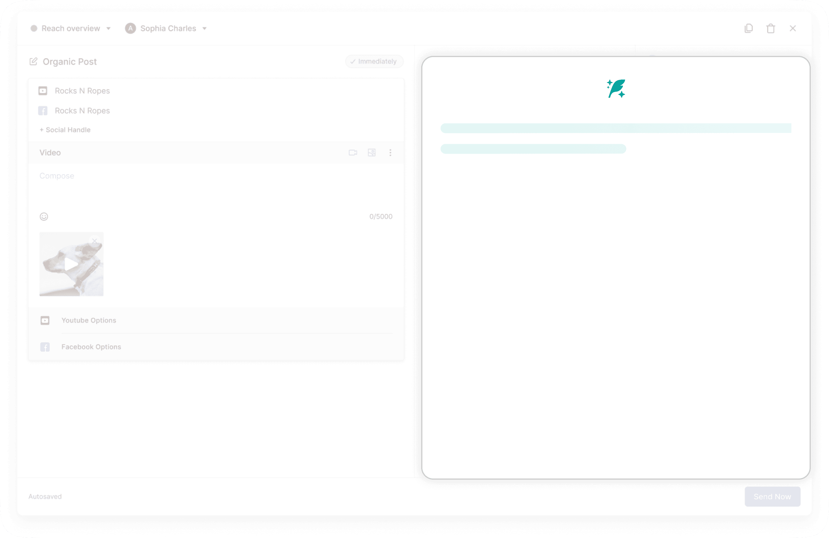


Instead, we were intentional about creating a panel that supported a natural editorial flow:
It preserved real estate, respected users’ layout expectations, and gave us room for editing tools and didn’t block preview.
This also refers to the location of the Post Assets Selection panel, making it technically possible to repurpose existing code.

The what? - Chatbot vs Quick Drafts

Our design rationale was simple - We ditched trendy AI conversation experience for what users actually needed, Why ?
A chat UI added mental load and felt slow for users who just needed fast, editable captions—not a conversation.
Also AI conversations can sometimes get them into a infinite loop of exchanges and roleplay which eventually take away the primary focus of publishing.


Hence we pivoted to a non-chat, top down approach:
Always visible beside the post preview.
Straight forward text input to input the post topic and phrases about the product.
Compact prompt controls for tone, target, platform, and more.
A clean preview area for generated results—with quick actions to edit, regenerate, or accept all grouped together for comparison.
Inline tips and examples to guide first-time users without clutter.


Sneak peak into helix AI model
Closely wrking wth AI directors and their team. Engineers shared insights on how prompt parameters affected tone and specificity, which helped in shaping what inputs to offer to get worthy AI responses.
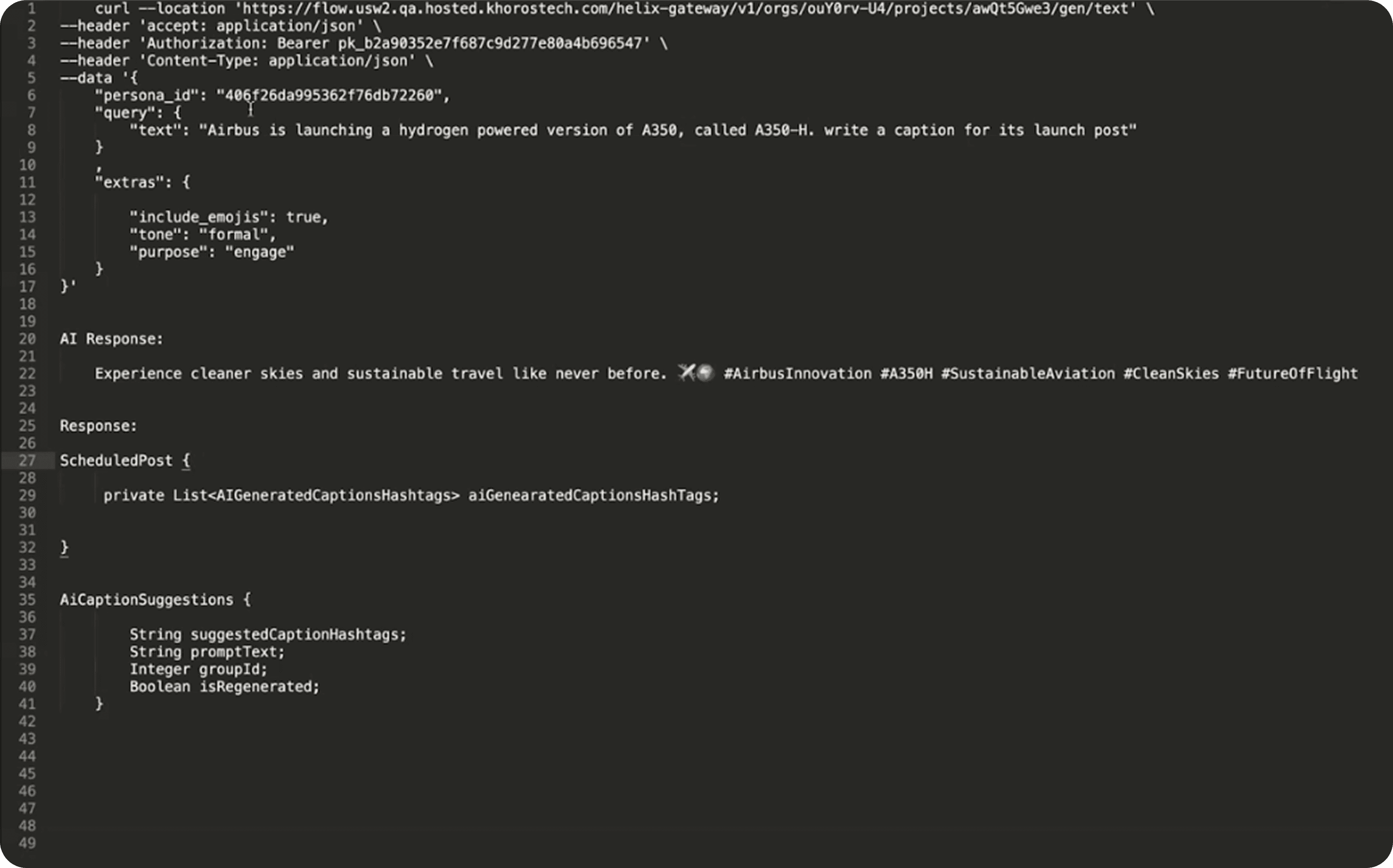
Even though the API had some limits on what you could input, we had a blast testing it out to see how well it responded. Check out some of the cool results we got!


For Prompt Settings and further refinements, We focused on Quick inputs
— but made the prompt settings to be “Set it and forget it” kind.
Tone, audience, purpose, and platform filters were optional. Teams could set their brand tone using URL links and text snippets. Some users enjoyed fine-tuning each post, while others preferred a one-time setup. Both approaches were effective with this construction.
Auto collapse input area after each generate hit, reducing visual overload and encouraging focused iteration. Clearing the top section helps users refine the output without distractions.


I evolved our existing design system with introducing by some chips dropdown which doesn't take too much real estate and can easily nudge into existing workflows whenever needed for secondary scaffholding actions.
This is to ensure UI consistency and cognitive familiarity, so nothing felt new or overwhelming.
Though optional the quick dropdowns settings like Tone, Audience, Platform, Language, and Emoji preferences acted as lightweight scaffolding to guide better AI outputs.

Response Card
Each AI response was presented as a card—clean, editable, and regenerate-able.
Here’s why: Users don’t trust a single output. They trust options.
We leaned into exploration bias—the tendency to compare and refine rather than accept the first result.
Giving 3 initial suggestions + options to regenerate or edit reduced decision friction. It turned AI from a mysterious black box into a co-creative partner. Text generator to a Comparison engine.
Users didn’t feel locked in. They felt in control.


User Education & Onboarding
Inorder to Craft a first time user experience, We introduced,
Feature Brief or Tooltip in panel header
"View Examples" link to show what good output looks like.
These reduce friction and uncertainty when first using the feature.


Time to Caption Reduced

Captions created with AI:
Went live faster
Performed on par (or better) than manually written ones
Were adopted quickly by power users
It saved time, reduced decision fatigue, and helped us stand out in a crowded market.

MVPs don’t have to impress. They have to unblock,
We received some both good and mixed feedback post roll out. I was cognisant about being in these customers calls to find out what were their first reactions.

Captions written with AI suggestions went live faster — and often performed just as well as handcrafted ones. Sometimes better.
I'm a Product Designer with a love for craft. I take complex tasks and make them intuitive and easy-to-use for people who rely on day to day business applications. Adept at building user experiences that speaks business, feels human, looks cohesive, easily accessible and just works anywhere, anytime. Expert at design solutions that involves solving for 0 to 1 products. Comfortable and obtained rich varied experiences working at fast paced startups, large scale enterprises, scale-up situations and remote working cultures. Few places I’ve manage to create such experiences are,


2025
SaaS
B2B
Co-Pilot
Social Management
New initiatives
User Research
AI.
AI
Contextual AI helped users move faster through their workflow—which meant removing writer’s block and better retention across high-activity accounts.
AI
Contextual AI helped users move faster through their workflow.


Khoros
Designing AI experiences and much more for SaaS enterprises.


Maps
Designing AI experiences and much more for SaaS enterprises.


Maps
Designing AI experiences and much more for SaaS enterprises.


"
Contextual AI helped users move faster through their workflow—which meant removing writer’s block and better retention across high-activity accounts.